
Three design projects we don’t hate
Designers hate each other.
Come on, it’s hard not to hate a group of people that all wear the same clothes, have pretty much the same haircut and DJ on the weekend.
Designers are often found in bands (with their equally loathsome designer friends) that make music that you have to pretend to like.
They don’t like Apple anymore because Steve Jobs died and it’s not as exclusive as it used to be. We get paid £2 million pounds a year and work two days a week.
We’re a hard bunch to like.
But I promise you, we despise ourselves more than any non-designers ever could.
What designers hate more than themselves is work that other designers have produced. This is because:
a) They didn’t think of that idea
b) Everybody on Twitter says they hate it
c) They never get a chance to work on projects like that
d) Everybody on Twitter says they hate it.
With this in mind, and in the spirit of self-improvement, I am going to try my very best to list three of my favourite design things that have caught my eye.
I really like the Five Guys brand

Walk into Bryon, GBK and most other high-street eateries and you will be greeted by the same chalkboard-laden, retro-chic brand interior. It’s all looks very similar, and if you squint you could forget which restaurant you have walked into.
Five Guys stands out.
It’s simple and functional and reflects the Five Guys’ mission statement of “no frills” burgers and fries. It’s refreshing, simple and clean. And more importantly, the brand message is consistent on all of their collateral.
Plus, the burgers taste great (Five Guys – send me free stuff).
Yorgos Lanthimos film posters


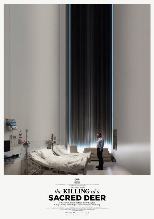
These are great. They tell a story by themselves.
The posters look amazing without the need for huge-budget CGI. They illustrate how powerful a good idea is – and how simply it can come together.
The ‘new’ Mastercard logo

Let’s try very hard not to be all ‘Twitter’ about this shall we?
Mastercard has dropped its name from its brand. A clunky ten-letter logo is going to struggle at small sizes, and who really has to read the word ‘Mastercard’ before they recognise the brand?
Nowadays, we look at tiny logos on tiny screens that we register for mere seconds before continuing to swipe through our smartphones.
The need for simplicity has never been so paramount.
The Shell, Apple and Nike logos can be identified with a symbol, like Mastercard, and have been simplified in small increments over their lifetimes. Despite the usual backlash of fury and hate, following in the footsteps of these brands is the right move for Mastercard.